Reporting Dashboards
Comprehensive data-visualization dashboards that provide actionable insights to healthcare providers
I spearheaded the project at CipherHealth to create reporting dashboards for the new Self-Service Rounding platform. This enables healthcare providers to draw insights from questionnaires that patients send directly from their smart phone.
The patient-facing platform is extremely configurable, allowing organizations to deliver anything from genetic health assessment forms to discharge preparation and satisfaction surveys.
Mission: Deliver a single solution to fit all possible app configurations.
My role: Associate Product Manager
Timeline: Two months from vision to MVP
Tools: Miro, Figma, Looker
Team: As Associate Product Manager I led a team of eight engineers and two designers to create two data-visualization dashboards to track user inputs and analytics about the programs themselves.

The Problems
Self-Service Rounding is highly configurable, but customized reporting is not scalable. A single solution needs to work for every use case.
Many different personas interact with the data, so the reporting needs to be both highly filterable for data analysts and easily digestible for executives.

The Solution
I led a cross-functional group of developers and a UX/UI designer to build two reporting dashboards. One dashboard contains insights from user inputs—the Results dashboard. And the other provides engagement metrics and insights about the effectiveness of the program—the Performance dashboard.
Let’s dig into how we arrived at that solution as a small, inquisitive, agile team with a short timeline and a clear vision and objective.
Discovery
Collaborating with the App Team
Before work could begin for reporting, I needed to understand the platform and all of the various inputs, triggers, and workflows that are possible.
I worked extensively with the Product Manager and developers as they built the app to define and align on terminology, formats, and metadata, so we could receive predicable outputs regardless of the use case.
Key Terms
These are some useful definitions for key terms that were used in this project.
Rounding: the activity of checking up on a patient using predetermined questions about their well-being and experience, and recording these responses in CipherHealth software.
Self-Rounding: a scripted choose-your-own-adventure interface that resembles a chatbot. A patient interacts with this on their own smart device, starting from a link sent via SMS.
Self-Round (singular): a single instance where a patient opens the self-rounding link.
Rounding Script: a set of questions in CipherHealth software that is used to round on patients.
Opportunity Area: a negative response to a rounding question. For example, if a patient chooses a negative response to a question, such as "Do you understand your plan of care?", this counts as an Opportunity Area.
Issue: if an Opportunity Area is related to problem that needs to be resolved by a person, an Issue is logged. For example, if a patient reports that they do not understand their plan of care, an Issue is generated so someone can come back and explain the plan to the patient.
Structured Response: the result of a multiple-choice question.
Free-Text: any text that is typed into an entry field. This usually accompanies a Structured Response question to allow patients to provide additional information.
CareGram: staff recognition or appreciation message.
Research Interviews
At the beginning of the reporting project, I interviewed a diverse cast of potential users—both inside CipherHealth and from several of our largest customers. I learned some basics about how everyone hoped they could use the data to learn, adjust, and improve patient experience. At the end of each interview I set a date in the future for them to review our prototypes.
2. Design
Design Sprint
I assembled a cross-functional team of Product Managers, Developers and my UX/UI designer, who participated in a five-day, fast-paced design process, where we defined and refined the issues and potential solutions. Each day we worked together to empathize with our users, understand their challenges better, and find solutions tailored to their needs.
We used a modified version of Steph Cruchon’s template on Miro. I facilitated the meeting to keep us on track and make sure everyone’s voice was heard. The steps we followed were to:
Map issues to user personas
Sketch solutions that address the issues
Decide which solutions we should test with real users
Wireframe a prototype and decide which personas to test with
Test the prototype with real people and report back with our findings
We reconvened the group after testing to shift from discussing the whats and whys of the project to the hows and whens. I’ll cover that below.

Steph Cruchon’s Design Sprint template on Miro.
First Design Iteration
I defined a prototype dashboard based on our shared design language and framework for data visualizations and widget containers. The focus of the first testing round was on content relevance, with limited interactivity.
Objectives:
Test concepts, not aesthetics
Learn how users will share the data (i.e. use images in presentations, export to csv, etc.)
Explore metrics and learn what data is most actionable
Specifications:
Custom data visualizations for Self-rounding metrics (pie charts, trend lines, tables, etc.)
Simulated functionality like filters, tooltips, and click to drill-down behaviors
Realistic style that leverages the existing design system
Sections for simple metrics like counts, trending data, charts to show breakdowns, and raw data tables


3. Test
Research Interviews
For this project we interviewed more than 30 users, spanning many different job roles and use cases.
I worked with the UX/UI designer to mock up a prototype in Figma, which we iterated on each time a set of interviews finished. We invited participants to interact with the prototype, rate features, and tell us how they would use the reporting in their roles.
User Testing Round 1
I led the team to create a test script designed to learn the following:
User Interpretation: Understanding how users perceive elements like data filters, toggles, and metric displays
Relevant Metrics: Identifying which metrics users find most valuable and how the it relates to their roles
Actionability: Assessing how users plan to take action from the data presented, and the methods they would use to share or present the data to others
Feedback for Improvement: Collecting user feedback on layout, widgets, clarity, and suggestions for enhancements
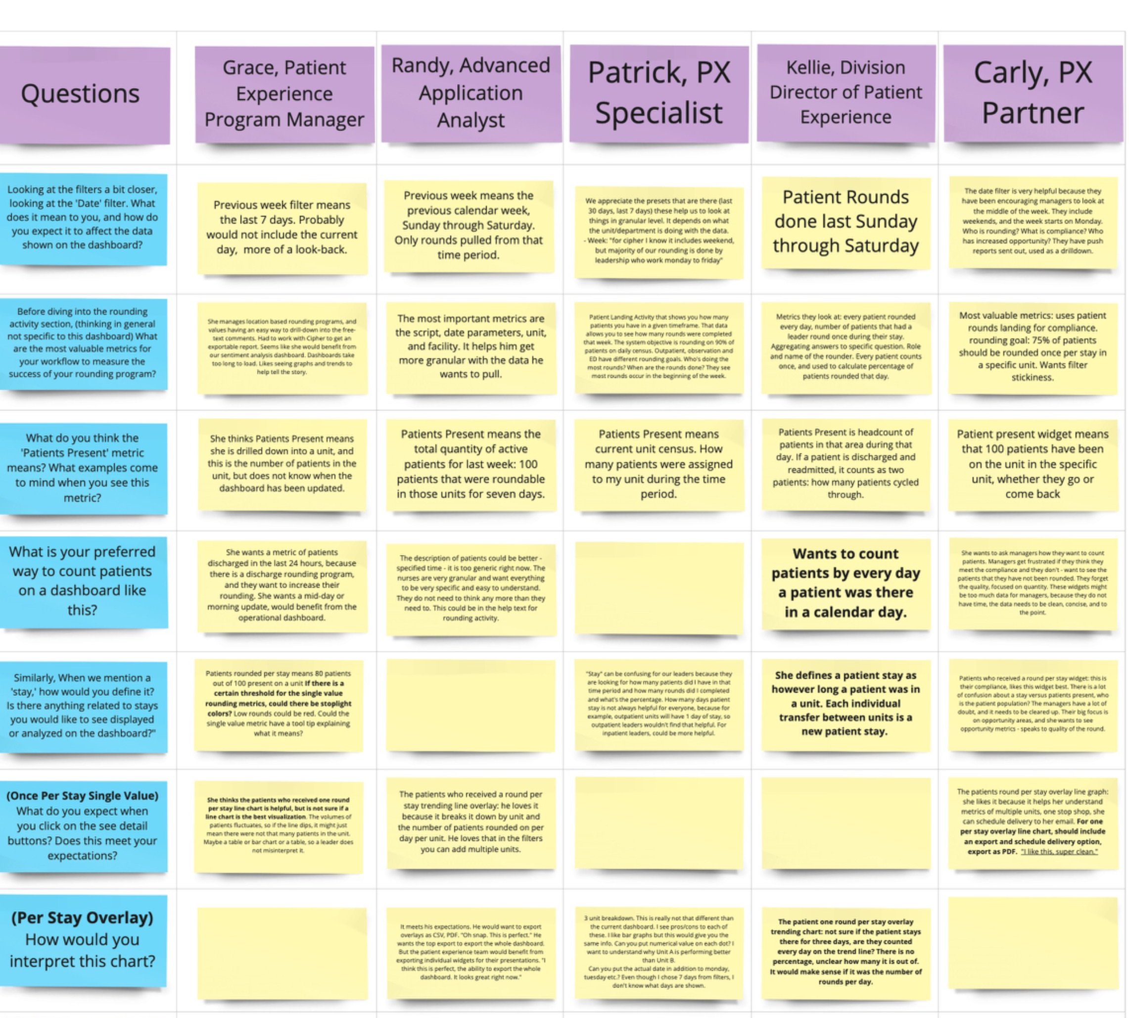
Table in Miro to record each participant's answers to our scripted questions.
Analysis
Using the feedback we got from the interviewees, I worked with the designer to group comments into categories.
A major pattern emerged in the interviews, and I consolidated the users into two categories:
People who want to know what patients said
People who want to know how the program is performing
While there was some overlap of these categories, our research indicated that most users are only interested in one type of data or the other.

Responses grouped into topic categories.
Surprises
Two of the users we interviewed said something we did not expect at the time, but is obvious in retrospect. In order to serve specific populations better—and improve outcomes based on Social Determinants of Health—they wanted to be able to drill down in multiple dimensions. They said something like “The number of respondents that prefer Spanish is interesting, but I want to see a breakdown of that number by age.”
Similar behavior is available, but not very user friendly—expecially for users who are not data savvy. This presented a new opportunity to push the limits of what we show on our dashboards, and the concept fueled the team’s creativity as we researched the capabilities of our platform and database.
4. Iterate
New Direction
The first round of interviews revealed the two user groups, and so I realized the opportunity was to create a custom solution for each user group. This way we could provide the following:
Multi-dimensional population drilldown charts
Clear separation between reporting about the user inputs and the health of the program itself
Targeted metrics that suit the separate use cases
More comprehensive dashboards without them being too long
Deeper drilldowns and more deliberate filtering

Specifications
Instead of one prototype, I specified that for the next round of testing we were going to prepare two prototypes. One for the Results of the Self-rounds, and one to learn about the Performance of the program.
In the Results dashboard, we reported about the number of patients and Self-rounds, breakdowns of positive and negative responses, and a special focus on the Opportunity Areas (negative responses).
In the Performance dashboard, we reported the number of patients and Self-rounds (same as Results), trending data like participation over time, multi-dimensional tables to identify patient populations, breakdowns of complete vs. incomplete interactions, and raw tables about Answered, Skipped, and Abandoned questions.
Ex. Abandoned Interactions
The most relevant metric to the health of a self-guided program is to know where users drop off. By showing a table of each question with the percentage of users who abandon the interaction at that point, we can address problematic questions, asking ourselves “What is it about question 5 that causes so many users to abandon the self-round?”
Testing Round 2
I wrote a new test script with our UX/UI designer that suited the new prototypes, and together we interviewed another batch of users. I facilitated the interviews while the designer took notes, and after each interview the designer created an interview snapshot to reflect what we learned. (While I didn’t create this, it’s too good not to share it.)
Test Outcomes
In the second round of testing, we received very excited feedback. The split solution met the needs of each group, and we found (as we expected) that users gravitated to one of the two dashboards—and that each dashboard was preferred by roughly 50% of the interviewees. We knew we were moving in the right direction.

5. Build
MVP / MMP Specifications
For this project, the Minimum Viable and Minimum Marketable Product was very clear.
The inputs from the Self-rounds to be predicable and organized (i.e. We need to know if Question 1 is multiple choice, and what free text input is related to it, and we need to know whether responses are considered negative or positive, and we need to know whether it was answered or skipped, and we need to know if it was visible at the time the session times out)
The database needs to be structured to accept the variety of inputs we get into tables that can output benchmarkable visualizations
The dashboards need Explores (Looker terminology for a collections of fields) to support the visualizations
Visualizations that provide the data our customers want
Functionality to export, send, and alert users when thresholds are met

User Stories
I wrote many research spikes and user stories for the Data Engineering Team, collaboratively refined them, tracked their progress, performed QA, and evaluated the builds against acceptance criteria.
I created bug tickets, wrote enablers and other NFRs to help the dashboards to perform better.
Documentation
I wrote clear and concise documentation for internal audiences like Support, Sales, and Customer Success in Confluence. I collaborated with our Sr. Technical Writer to write tooltips (hover to discover text) for visualizations in the dashboards. And I wrote the first draft and consulted on later drafts of external documentation and education materials.
Training
I trained all of the initial users of the dashboard in a “train the trainer” model.
Support Tickets and Hypercare
In the three weeks following the launch of the dashboards I led the team through Hypercare, where we prioritized all issues reported and resolved them immediately.
Following that, I worked closely with the Support and Customer Success teams to answer complex questions, fix bugs, and create new support materials and FAQs.
6. Iterate Again
And again and again…
The old writer’s axiom is as true for Product Management as it is for writing. To paraphrase:
A Product is never complete, we just have to know when it is complete enough.. and then continue to iterate to make it ever more useful and user friendly.